Tuesday, 15 November 2011

How to show the Value inside the Thumb of Slider control in Silverlight..?

Recently I found some people keep asking this question,

"in Silverlight, How can I show the Value inside the Thumb of a Slider Control?"

well, when I tried to answer this question, I found this was not that easy to solve as I expected, so I dive deep into how the Slider control was designed originally by Microsoft an tried to find out some solution.

Now I got it, I rewrote the ControlTemplate and generated a brand new Slider which support showing the Value(or anything) inside the Thumb

Click to See the Live Demo

The screen shots are here:


When you slide the Thumb, the value 0.0 changes to be the Value property of the Slider control, like this:


How can I get this?

First let's see what is a Slider control? a Slider is a Range Control which indeed is a Control, why should I mention this? because a Control always have its own Template property, by modifying the Template property, you can "Assign" this Control different looking

in this example, i rewrote the Slider's Template(which is a ControlTemplate), so the Thumb could show the Value of the Slider


Saturday, 5 November 2011

Release the Power of Silverlight Data Binding

DataBinding in Silverlight is so powerful, properly using it can make your work extremely easy and save you tons of time.

In this Live Demo I demonstrated how to use Data Binding to enable a tree view node to implement Add, Delete, or Edit action

You can also download the Source Code here , since I am still updating this application, so the source code would be different every few days.


I didn't use any weird third party controls such as Telerik, it's just Silverlight Toolkit controls and other Silverlight foundation knowledge 


If you really interested, you can download the source code as your real project's  template(it's quite easy to extend other functionalists by yourself), it's totally free. I am very happy if you like this project.


Let me briefly introduce what it use for.

Suppose you are a Manager of a big Property Management Inc, You want to edit building information(that means Add, Edit or Delete a building), and you want to continue editing the Floors in this building, and the rooms in some particular Floor

this small Silverlight application is to help you implementing your work. By hovering the mouse to Building, Commands for this building will appear, including Edit, Add Floor, or Delete, Same command will appear for Floor and Room

By clicking the Edit or Add commands, a child window will appear to let you input or modify some basic information(currently only Name, but I will add more fun stuff later)

the Process is easy and straightforward,in the back, it is supported by well organized data(we call it ViewModel), without these neatly wroted data, the UI's code behind would be in a big messy if to implement the same functionality.


How to use it, at first, when you click


a Child Window would pop up letting you input a building's basic information


After that, a building item will be created and you can see it in the tree


when your mouse hover the Building, some other command icon would appear


this include an default "Edit" icon and an Expender, clicking the Expender you will see more commands


that would include a "Add Floor" command, "Delete Current Building" command, and a "Change Icon" Toggle Button. By Clicking the "Change Icon" toggle Button, a ListBox would appear letting you choose different icons


I changed the ListBox's ItemPanelTemplate to be a WrapPanel and make the Background to be transparency so that it looks more professional.

You can find similar fonction in Floor and Room items

everything listed above are done through DataBinding, now I briefly introduce how this application is designed and how these commands are bind to the VewModel

Wednesday, 24 August 2011

Created a new Silverlight Control to move different Layers

Well, it's very hard for me to find a name for my new Control, but I promise this new control is very powerful, the control is still under developing, what I am showing you here is just an aspect of it. I will release the full version in few days.

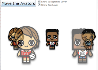
one screen shot here(or Click to see the Live Demo):


If you click the button "Move the Avators" the avatars will move, and you can see they have different layers,
the back layer moves slower and the front layer moves faster, just like playing video game, is't it?

and I promise in the next version, you will have ability to control the moving speed, and how many avatars you want to show..

the live demo is here:

Tuesday, 23 August 2011

Use Behavior to create a MaskedTextBox in Silverlight 4


Haven't update my blog for long time.. too many things to handle these days

I noticed lots of people on the Silverlight forum are asking for some FREE MaskedTextBox for Silverlight, well, I know telerik do provide a control called RadMaskedTextBox and it's pretty good, But I want to say by using Behavior, you can create a MaskedTextBox from scratch as well, and it works pretty well

First what is Behavior? Behavior was a set of classes which was introduced by Blend in order to let UI designer to easily extend a control's ability. 

to start, you need a reference to a Blend Assembly:
Microsoft.Expression.Interactivity.dll

and in XAML you need a namespace for this Assembly(normally we use i: for this namespace)
xmlns:i="http://schemas.microsoft.com/expression/2010/interactivity" 

in project, we add a class "MastTextBoxBehavior.cs" which inhered from Behavior<TextBox> class(because we want to extend the functionality of element TextBox, so inside the generic <>, we'd better fill class TextBox)
public class MaskTextBoxBehavior : Behavior<TextBox> {...}

next, we have to define a DependencyProperty which could enable binding and animation
public static readonly DependencyProperty TrueTextProperty =
DependencyProperty.Register("TrueText", typeof(string),typeof(MaskTextBoxBehavior), null);

We define this DependencyProperty TrueTextProperty is because we have to let other UI element to access the true text value of the MaskedTextBox later.

Add a wrapper for this DependencyProperty
public string TrueText       
{       
    get       
    {       
        return (string)GetValue(TrueTextProperty);       
    }
       
    set       
    {       
        SetValue(TrueTextProperty, value);       
    }       
}

Inside  the OnAttached() method, add a handler for TextChanged event
protected override void OnAttached()
{
    base.OnAttached();

    AssociatedObject.TextChanged += new TextChangedEventHandler(AssociatedObject_TextChanged);
    TrueText = string.Empty;
}

void AssociatedObject_TextChanged(object sender, TextChangedEventArgs e)
{
    int index = AssociatedObject.SelectionStart;
    string newString = AssociatedObject.Text.Substring(index - 1, 1);

    if(TrueText.Length != AssociatedObject.Text.Length)
        TrueText = TrueText.Insert(index - 1, newString);

    AssociatedObject.Text = new string('*', AssociatedObject.Text.Length);
    AssociatedObject.SelectionStart = index;
}

The AssociatedObject_TextChanged method is in charge of watching the text change and save the true value into the TrueText property, while keeping the TextBox.Text always “*”, so what the user see on the screen will always be “*”, but through TrueText property, the user can access the complete text values he just typed.

The Behavior<> class is done, let’s return to XAML, write a <TextBox….> element like this(remember to add <i:../> namespace as I mentioned at the beginning, <local: .. is a namespce which include the MaskTextBoxBehavior Behavior)
<TextBox MinWidth="200">
    <i:Interaction.Behaviors>
        <local:MaskTextBoxBehavior  x:Name="mm"/>
    </i:Interaction.Behaviors>
</TextBox>

Now the MaskTextBoxBehavior is attached to a TextBox element, you can add another <TextBlock> element and bind the Text property to the TrueText property of this Behavior for testing, like this:
<StackPanel VerticalAlignment="Top" HorizontalAlignment="Left">
    <TextBox MinWidth="200">
        <i:Interaction.Behaviors>
            <local:MaskTextBoxBehavior  x:Name="mm"/>
        </i:Interaction.Behaviors>
    </TextBox>
    <TextBlock Text="{Binding TrueText, ElementName=mm}"/>
</StackPanel>
When you typing in the TextBox, what you will see will always be the “*”s, and in the same time the <TextBlock..> will show the actual values.
Now a MaskedTextBox is done, you don’t need to spend money buying the third party Component, just using a Behavior…

For the time issue, I didn’t make the method  
void AssociatedObject_TextChanged(object sender, TextChangedEventArgs e)
perfect, Currently the method only support adding a char, if you try to use Backspace to delete a cha in the TextBox, some error result will happen. While this’s not that difficult to make it perfect, just spend some time and do some careful testing is ok.

Enjoy the Silverlight


Friday, 20 May 2011

Silverlight Wizard Custom Control for sharing

I created a lightweight Silverlight Wizard Custom Control, you can download the dll here:
I also provide a sample project showing you how to use the Wizard dll in your real project, you can download the demo project here:

You can view the live Demo here:

If you want to introduce this control to someone else, please reference my Blog post

Now I briefly introduce how to use this control,
First: you have to reference this Wizard.dll to your project;
Second: you have to host the Wizard in some container, either in a Child Window or just a User Control. I prefer Child Window.
I assuming you are hosting the Wizard in a Child Window

Third: add the following XML namespace: to the Child Window's XAML file:
xmlns:wizard="clr-namespace:Wizard;assembly=Wizard"

Delete the OK and Cancel button, rewrite the XAML codes like this and be careful the core parameters need to be set are
ImagePathUri
TitleText

<Grid x:Name="LayoutRoot" Margin="2">
<Grid.RowDefinitions>
<RowDefinition />
</Grid.RowDefinitions>
<wizard:ChunXuWizard
x:Name="createUserWizard"
Grid.Row="0"
Margin="0,-2,0,0"
ImagePathUri="/SilverlightApplication18;component/Images/people.png"
TitleText="Add a new student"
Loaded="createUserWizard_Loaded"
/>
</Grid>

please make sure the image /SilverlightApplication18;component/Images/people.png exist in the Image folder, otherwise Wizard will not show anything in the image block(it's not a big deal, isn't it?)

than in the code-behind event method ... you have to insert the pages which the Wizard would like to slide, I created 4 UserControls and I list the codes here:
ObservableCollection<Control> t = new ObservableCollection<Control>();
t.Add(new StudentDataInputBasicInfomation());
t.Add(new StudentDataInputBasicInfomation2());
t.Add(new StudentDataInputBasicInfomation3());
t.Add(new StudentDataInputBasicInfomation4());
this.createUserWizard.NormalControls = t;
Fourth, Create a new Child Window in your code and show the window, you can see the cool slide Wizard living in your screen, like these screen shot:

Click Next Button


The page will slide to the Next page, and by clicking the Back Button, you can go to previous page, the data will be kept.

Next time, I will introduce some detail of how to use the control.

Enjoy the silverlight

Thursday, 19 May 2011

Telerik Silverlight RadGridView ComboBox Column data binding problem

I am using telerik Silverlight GridView control, one of the cool features is that it has a ComboBox Column, which can enable the developer embad a ComboBox in GridView's column
like this:


While of course you can embad such a ComboBox in regular DataGridView(i mean, in micorsoft silverlight toolkit), but Telerik makes things much eazier..

But if you try to bind data through ViewMode to the ComboBox Column of the RadGridView, you will encounter some serious problem.

Let's design a lightweight project to test this cool features of Telerik(this has be existing for long time, I don;t know why Telerik guys doesn't fix it for so long time)

suppose you have two set of entities, People and Country, like this

public class People
{
public int CountryID { get; set; }
public string FirstName { get; set; }
public string LastName { get; set; }
}

public class Country
{
public int Id { get; set; }
public string Name { get; set; }
}

and we has two set of collections which will be used to bind with the RadGridView and ComboBox column in the GridView

private ObservableCollection<People> peoples = new ObservableCollection<People>();
public ObservableCollection<People> Peoples
{
get { return peoples; }
set { peoples = value; }
}

private ObservableCollection<Country> countries = new ObservableCollection<Country>();
public ObservableCollection<Country> Countries
{
get { return countries; }
set { countries = value; }
}

than we assign some value to the two collections


foreach(var x in
new People[] {
new People { CountryID = 0, FirstName = "Sebastain", LastName = "Vettel" },
new People { CountryID = 1, FirstName = "Fernando", LastName = "Alonso" },
new People { CountryID = 2, FirstName = "James", LastName = "Button" }
})
{
Peoples.Add(x);
}


foreach(var x in
new Country[] {
new Country { Id = 0, Name = "Germany" },
new Country { Id = 1, Name = "Spain" },
new Country { Id = 2, Name = "UK" }
})
{
Countries.Add(x);
}

now the Peoples and Countris are ready to be binded to the XAML objects. Bind the DataContext

this.DataContext = this;

let's see the View XAML codes, the RadGridView like this:

<controls:ChildWindow

<telerik:RadGridView x:Name="radGridView"
AutoGenerateColumns="False" ItemsSource="{Binding Peoples}">
<telerik:RadGridView.Columns>
<telerik:GridViewComboBoxColumn
DataMemberBinding="{Binding CountryID}"
UniqueName="Country"
SelectedValueMemberPath="Id"
DisplayMemberPath="Name"
ItemsSource="{Binding Countries}"/>
<telerik:GridViewDataColumn DataMemberBinding="{Binding FirstName}" UniqueName="First Name"/>
<telerik:GridViewDataColumn DataMemberBinding="{Binding LastName}" UniqueName="Last Name"/>
</telerik:RadGridView.Columns>
</telerik:RadGridView>


Simple and straightforward, and let see the result, like this:


everything is fine. Now let's click the FirstName column, what you will see is like this:


the ComboBox column's content is empty, what's wrong? Is there anything coding problem?

The answer is nothing wrong, this is one of the Telerik Silverlight GridView's  famous bug.

What you have to do is to remove the ItemsSource binding in the XAML side and move the binding in the code-behind, this is ugly, meaning if you have to use MVVM you have to pass some parameters to the ViewMode(at lest the ComboBox object) and breaking the graceful of MVVM.

Let's do some change to meet Telerik's behaviour, remove the ComboBox Binding
<telerik:GridViewComboBoxColumn
DataMemberBinding="{Binding CountryID}"
UniqueName="Country"
SelectedValueMemberPath="Id"
DisplayMemberPath="Name"
ItemsSource="{Binding Countries}"/>
and add this to the code-behind:
((GridViewComboBoxColumn)this.radGridView.Columns["Country"]).ItemsSource = Countries;

Now run the application, everything is as expected.


Monday, 2 May 2011

How to create a borderless window which can be drag and move in Silverlight Out Of Browser Model?

In out of browser model, if you choose Borderless style, the TitleBar will disappear and you can't drag and move the whole window, to solve this problem there are several solution, one of them is to use
Application.Current.MainWindow.DragMove(); method,

Ok, let's create a small application to test this:

Create a Silverlight Application, make sure it will be running in out of browser model. In the MainPage UserControl's LayoutRoot Grid, add two rows and a Rectangle, fill the Rectangle's content with some solid color(here I cheese Blue) like this:
<Grid x:Name="LayoutRoot" Background="White">
<Grid.RowDefinitions>
<RowDefinition Height="1*" />
<RowDefinition Height="10*" />
</Grid.RowDefinitions>
<Rectangle Name="rectangle1" Stroke="Black" StrokeThickness="1" Fill="Blue"/>
</Grid>
The blue Rectangle will be our new TitleBar which could be used to drag and move the whole window. Let's add the core code behind.
Add a MouseLeftButtonDown Event to the Rectangle, like this:
<Rectangle Name="rectangle1" Stroke="Black" StrokeThickness="1" Fill="Blue" MouseLeftButtonDown="rectangle1_MouseLeftButtonDown"/>

Implement the event's code behind:
private void rectangle1_MouseLeftButtonDown(object sender, MouseButtonEventArgs e)
{
Application.Current.MainWindow.DragMove();
}
Now run the application(make sure it's running in out of browser and Bordless Model), you can see a bordless window with a big blue TitleBar, use mouse to drag and move the title bar, it works just as we expected

one thing I have to mention, to make the Rectangle drag and move, you have to Fill this Rectangle with something, ether you fill with some Color or some other Control. Otherwise, it will not react to the mouse click.

Now, the window could be drag and move, but how to close it? How to maxim it? Minim it? Well the answer are all in the Application.Current.MainWindow.WindowState Property The corresponding method are:
Application.Current.MainWindow.WindowState = WindowState.Maximized;
Application.Current.MainWindow.WindowState = WindowState.Minimized;
Application.Current.MainWindow.WindowState = WindowState.Normal;

Now let's add a content menu to the Blue Rectangle and add Maxim, Minim and Normal command, Like this:

<Rectangle Name="rectangle1" Stroke="Black" StrokeThickness="1" Fill="Blue" MouseLeftButtonDown="rectangle1_MouseLeftButtonDown">
<toolkit:ContextMenuService.ContextMenu>
<toolkit:ContextMenu>
<toolkit:MenuItem x:Name="menuMaxin" Header="Maxim" Click="menuMaxin_Click"/>
<toolkit:MenuItem x:Name="menuMinim" Header="Minim" Click="menuMinim_Click"/>
<toolkit:MenuItem x:Name="menuNormal" Header="Normal" Click="menuNormal_Click"/>
</toolkit:ContextMenu>
</toolkit:ContextMenuService.ContextMenu>
</Rectangle>

To use the Content Menu, You have to add System.Windows.Controls.Input.Toolkit to your project's Reference

let's fill the code behind:
private void menuMaxin_Click(object sender, RoutedEventArgs e)
{
Application.Current.MainWindow.WindowState = WindowState.Maximized;
}

private void menuMinim_Click(object sender, RoutedEventArgs e)
{
Application.Current.MainWindow.WindowState = WindowState.Minimized;
}

private void menuNormal_Click(object sender, RoutedEventArgs e)
{
Application.Current.MainWindow.WindowState = WindowState.Normal;
}


that's, when running the application, you can Maxim, Minim and resume by clicking the content menu

this application is not looked nice, it just telling you how to control Windows behaviour in Out of Browser model, you and add some Icon on the Top-Right corner to make the application more reasonable.